AutomatedBuildings.com
Article - May 99
[Home Page] |
[an error occurred while processing this directive]
(Click Message to Learn More) |
|
|
Simplifying
Complex Hospital Environment Control with Graphics Prepared
by Ken Sinclair, Sinclair Energy Services Ltd
This article was
originally published in the Canadian Hospital Engineering Society CHES Quarterly Journal
in Winter of 1997. Although rapidly approaching the status of Dinosaur Dung it still has
some good fundamental automation rules that can be reapplied to today's systems.
|
|
ABOUT THIS ARTICLE
In the last few years powerful, low cost DDC graphics have
made it possible to greatly simplify complex hospital environmental control systems.
Graphical maps of the actual hospital layout, using point and click navigation, allow easy
access to large quantities of crucial operating information. Documentation and other
pertinent text data can be interactively linked in hypertext or other Windows programs.
Powerful graphic capabilities are here now at low cost, and only require us to request
their use to simplify presentation of our complex data. If a common Graphic Guideline is
developed for your hospital complex, multi vendor systems can exist and provide similar
functionality, in separate program windows, on a common personal computer. If the Graphic
Guidelines are implemented at the concept stage of the project, communication can be
greatly improved, and project management and commissioning greatly simplified. Powerful
Internet tools, described in the article, are available to help you implement this
concept. The case study includes all these concepts.
BACKGROUND OF CONCEPTS
[an error occurred while processing this directive]The
following concepts did not develop overnight. They have been a slow evolution over the
last twenty years, waiting for the cost and capabilities of computers to make graphical
interfaces a reality. I had the opportunity to be involved in this evolution. In the mid
1970’s I had the chance to work on a large DDC system at the University of Alberta.
This system used powerful interconnecting navigation graphics, with 1/4 by 1/4 inch
resolution, that came complete with a system analyst and software support team. The
computers were the size of refrigerators, and total project cost was over four million
dollars. In the early 1980's Vancouver General Hospital developed a relatively low cost,
powerful graphic navigation system, using the personal computer and stand alone panel
technology with custom DOS graphics. In the early 1990's a 13 building project at the
University of Victoria, used graphics as the specification media. This included the
specification of virtual software points and start up code, to provide an under budget,
simplified project that required no staff training to operate. The project used the low
cost powerful PC, and Windows to combine 10 existing environmental control systems. A
parallel project at BC Buildings Corporation saw the development of the Corporation’s
Graphic Guidelines and Design Manual for their DDC systems, which they call Client Comfort
Systems (CCS). The next major evolution was the conclusion that the most cost effective
method of distributing this manual to their design consultants was the Internet. This
allowed this evolutionary document to be available to anyone in the Internet world.
Sinclair Energy Services Ltd used this evolutionary document as the basis for the
specification for a large retrofit at the Nanaimo Regional General Hospital.
NANAIMO REGIONAL GENERAL HOSPITAL (NRGH)
The Nanaimo Regional General Hospital (NRGH) project is a
self financed, energy performance contract, without a traditional energy performance
contractor. This method was chosen because it presented the lowest cost and the greatest
amount of project control. The project included lighting retrofits, 28 adjustable speed
drives, and an upgrade to complete DDC control, plus integration of existing DDC systems
of three vendors. 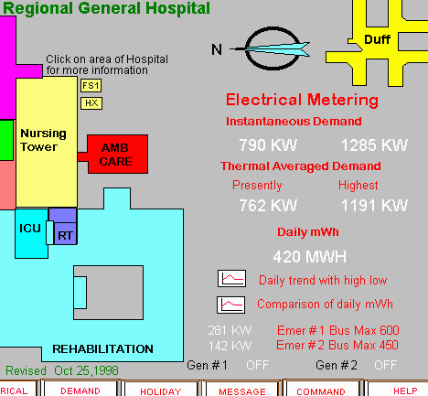 The project received
funding from the BC Hydro Power Smart program. For the purchase of the DDC system a
Request for Proposal used the specification documents from, and referenced to the Graphic
Guidelines on the Internet. The hospital chose to accept the format of the existing
on-line Graphic Guidelines. Custom hospital graphics were generated using the style set by
the BCBC Design Manual. The Request for Proposal (RFP) provided extremely competitive
prices from several DDC vendors. The age and capabilities of some of the existing DDC
systems caused us to consider the low cost swap out of existing hardware to gain new
functionality and inter-operability with a common graphic platform within the main
hospital complex. A separate and remote Extended Care facility, that did not require the
same integration was interfaced though a Windows 95 virtual PC DOS window to provide the
same functionality as was originally provided on a separate stand alone PC. For the main
hospital complex the point database, which included the actual naming convention, all
virtual and real points definition and device specifications, was turned over to the
successful vendor in spreadsheet format. These spreadsheets were used to automatically
generate portions of the vendor’s actual database. All pre-generated graphics files
were also turned over, but the vendor had not yet reached full Windows graphics compliance
so some regeneration was required. Existing AutoCad floor layouts were also used. Full
functionality of the original intent was achieved, and linking and presentation speed is
good. Graphics were used, as outlined in the original specification, to commission and
accept systems. Each graphic was printed out on a color printer and signed off by the
installing contractor and the accepting hospital representative. Calibration data was
printed out from system so the system could be as self documenting as possible.
The Main Menu, Graphic, shows the overview of the hospital
complex. Since the system was justified based on energy savings, both electrical and gas
energy are highlighted on the Main Menu screen. A click on trend icons provides access to
energy histories. clicking on any area of the hospital allows you to zoom to floor and AHU
details. The total intent of the complete project is summarized on this one screen which
provides interactive access to an incredible amount of data.
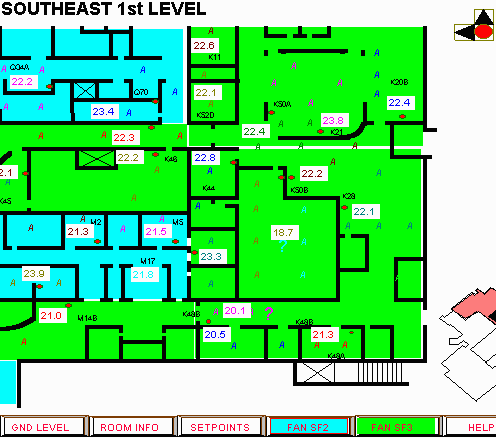 The generation of floor graphics presented a special challenge to try
to document what had never been documented in one place before. The original room names
had long disappeared, walls had been moved in multi renovations, and the addition of many
extra systems had changed the thermal zoning. This turned out to be a typical hospital
with all the dynamics changes that occur in a active hospital. All this information was
appended to the contractor’s original graphics, adding layers of information. The
above graphic shows a typical portion of a floor. Fan zoning is shown with color dots. The
room thermal zoning is shown with common colors for temperature and reheat diffusers,
which are shown in their approximate location with an A for air. Added variable valve
diffusers are shown as VAV. Clicking on the actual temperature will provide access to
programming and more detailed point information. The graphic contains an incredible amount
of information. Color is a powerful medium when used carefully. The pre-generation of the
dynamic graphics assisted the NRGH operators understanding of the new system as it came on
line. Trend graph icons for each air system allowed quick demonstration of each control
loop's success or failure. The output orientated code, linked to program icons, allowed
the operators to quickly learn the essence of the new control language, and allowed the
contractor and consultant to zone in quickly on problem areas.
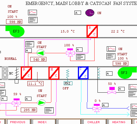
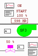
The Fan Graphic shows a typical air system. All trend,
program and time clock icons present detailed information with a simple click and point. 
INCREASING THE DEPTH OF THE DATA
By increasing the depth of the required data and not the
breadth we were able to add layers of useful information. Past dependence on paper
presentation has limited our ability to think in X, Y terms only, and to not consider
layering data in the logical third, or Z dimension. The hypertext penetration example set
by the Internet causes us to reconsider how we present data in powerful point and click
graphic databases. In addition to thermal and fan zoning, room numbers, room function,
names of occupants and other text information has been linked. We chose to do this using
the vendor’s interactive graphics because the data was relatively simple. A more
complex database task would choosing a separate software program, operating in another
window.
WINDOWS 95
Windows95 on a Pentium platform with lots of memory, proved
to be a good integrator of the existing DOS and new windows system. The virtual PC concept
operates most DOS systems well, allowing the use of separate communication ports and
printers. Programs that use extended memory and bend the original rules of DOS can be a
problem. Windows95 is not a panacea, but works for now. It is apparent that more low cost
PC power will lead to better, easy to use operating systems. Windows NT and even Unix are
likely in the near future. The point click windows like approach is here to stay, and
learning a completely new operating system before lunch is in our future. Operating
systems of the future, as with all good graphic interfaces, will become invisible to their
required functionality. The use of low cost color printers enhances trend graph
presentation, and makes the effort of accurately generating floor and system graphics
available to the ever present paper junkies. It also provides an excellent method for
everyone to insure that data on the system is accurate.
DDC MANUAL ON THE INTERNET
http://www.bcbc.bc.ca/Doing_Business_With_Us/Technical_Manuals/files/ccs/rights.htm
The DDC/CCS Design Manual on the Internet, is an excellent resource developed by BC
Buildings Corporation for the use of anyone. See instructions on the Net. For creating
graphical click and point orientated specifications the manual has many good ideas, plus
downloadable files for your word processor that include graphics and the necessary
linkage. I strongly recommend that if the concept of simplifying your hospital’s
environmental control or client comfort system interests you, that you review the several
hundred page manual. I suggest that you especially review the Section 7 Graphic Guidelines
that set some standard rules for graphic movement. Suggestions and input to the manual is
encouraged. I would suggest that you build a few complete operating and interlinked
graphic sets before recommending radical changes. What seems a good idea at the start
often falls apart when applied to many complexes. What the Guidelines suggests does not
limit creativity but only provides some minimum rules for graphic navigation and movement.
Remember that the Windows concept greatly simplified the interface of several different
programs by standardizing location, functionality and movement. Retrofitting your existing
DDC system graphics to incorporate Guideline standards can greatly improve your existing
operator interface.
Ken Sinclair, ESI Enviromation Services Inc/Sinclair Energy
Services Ltd Tel: (250) 656-5378 Fax: 656-2394 E-Mail: sinclair@enviromation.bc.ca
[an error occurred while processing this directive]
[Click Banner To Learn More]
[Home Page] [The
Automator] [About] [Subscribe
] [Contact
Us]

 The project received
funding from the BC Hydro Power Smart program. For the purchase of the DDC system a
Request for Proposal used the specification documents from, and referenced to the Graphic
Guidelines on the Internet. The hospital chose to accept the format of the existing
on-line Graphic Guidelines. Custom hospital graphics were generated using the style set by
the BCBC Design Manual. The Request for Proposal (RFP) provided extremely competitive
prices from several DDC vendors. The age and capabilities of some of the existing DDC
systems caused us to consider the low cost swap out of existing hardware to gain new
functionality and inter-operability with a common graphic platform within the main
hospital complex. A separate and remote Extended Care facility, that did not require the
same integration was interfaced though a Windows 95 virtual PC DOS window to provide the
same functionality as was originally provided on a separate stand alone PC. For the main
hospital complex the point database, which included the actual naming convention, all
virtual and real points definition and device specifications, was turned over to the
successful vendor in spreadsheet format. These spreadsheets were used to automatically
generate portions of the vendor’s actual database. All pre-generated graphics files
were also turned over, but the vendor had not yet reached full Windows graphics compliance
so some regeneration was required. Existing AutoCad floor layouts were also used. Full
functionality of the original intent was achieved, and linking and presentation speed is
good. Graphics were used, as outlined in the original specification, to commission and
accept systems. Each graphic was printed out on a color printer and signed off by the
installing contractor and the accepting hospital representative. Calibration data was
printed out from system so the system could be as self documenting as possible.
  The generation of floor graphics presented a special challenge to try
to document what had never been documented in one place before. The original room names
had long disappeared, walls had been moved in multi renovations, and the addition of many
extra systems had changed the thermal zoning. This turned out to be a typical hospital
with all the dynamics changes that occur in a active hospital. All this information was
appended to the contractor’s original graphics, adding layers of information. The
above graphic shows a typical portion of a floor. Fan zoning is shown with color dots. The
room thermal zoning is shown with common colors for temperature and reheat diffusers,
which are shown in their approximate location with an A for air. Added variable valve
diffusers are shown as VAV. Clicking on the actual temperature will provide access to
programming and more detailed point information. The graphic contains an incredible amount
of information. Color is a powerful medium when used carefully. The pre-generation of the
dynamic graphics assisted the NRGH operators understanding of the new system as it came on
line. Trend graph icons for each air system allowed quick demonstration of each control
loop's success or failure. The output orientated code, linked to program icons, allowed
the operators to quickly learn the essence of the new control language, and allowed the
contractor and consultant to zone in quickly on problem areas.