Time for Energy Dashboard
Standards for Buildings
To
obtain feedback and involvement from
the everyday users of buildings, we must standardise dashboard displays
and must go beyond technology and synergise it with human psychology
and perceptions.
|
December 2011 |
[an error occurred while processing this directive] |
|
Time for Energy Dashboard
Standards for Buildings |
| Articles |
| Interviews |
| Releases |
| New Products |
| Reviews |
| [an error occurred while processing this directive] |
| Editorial |
| Events |
| Sponsors |
| Site Search |
| Newsletters |
| [an error occurred while processing this directive] |
| Archives |
| Past Issues |
| Home |
| Editors |
| eDucation |
| [an error occurred while processing this directive] |
| Training |
| Links |
| Software |
| Subscribe |
| [an error occurred while processing this directive] |
Over
the last few years we have seen vast improvements in BAS graphical
display panels. Simple 2D graphics have been transformed to 3D panels
with animations and realistic floor plan images of buildings. The
graphical display panels of BAS vendors have become the showcase of its
product line. Now, the push for sustainability is taking it to
the next step, where most vendors have an “Energy Dashboard” as part of
their product suite. The dashboards are beginning to reach far more
than
just the conventional stakeholders of the buildings such as the
facility
mangers and the owners. The drive for sustainability in building
performance is including the one most important stakeholder, the ‘every
day users of the building’. In most BAS specifications now it is
specified to display energy dashboards in the foyer of the buildings;
“Provision of informative data feed to TV located on the ground
floor”. Along with the typical BAS vendors, third party start-up
organizations are joining forces to develop intuitive, user friendly
dashboards with various green buzz words. But, how informative and
consistent is the message to the general public? This article examines
the human perception of dashboards and the requirement of a standard to
communicate a consistent message to the most important stakeholder.
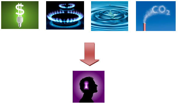
Organization such LEEDS, NABERS and Green Council bodies around the world are specifying how to achieving certain energy ratings. The key utility drivers are electricity, gas and water, along with CO2 emissions in a sustainable building. The rating standards specify how much should be used for specific ratings and what should be reported. However it does not specify how the data should be displayed in the report or to the general public. If you visit major 5 star hotels, most lobbies contain a large screen detailing their energy consumption to the general public. This is great. It is involving the everyday stakeholders of the building. However, if you visit the same hotel chain even in the same city, the data shown on the dashboards differs. One hotel displays KWH consumption on a pie chart, the other in a line chart, another breaks down the energy consumption per floor, one fails to show water consumption, the location of data displayed is inconsistent from one to another etc... The inconsistency of data displayed on a dashboard can create confusion to the general public. A professional in the BAS industry more than likely can easily interpret the data but for an everyday person, it is just another screen in a hotel lobby. To obtain feedback and involvement from the everyday users of buildings, we must standardise dashboard displays and must go beyond technology and synergise it with human psychology and perceptions.
Human psychology indicates that a consistent message is key to achieving a desired every day activity. For example at a set of traffic lights, we all know that red is stop and green is go. The push for sustainability buildings must become an everyday activity. Therefore, energy dashboards must be standardised. The colors, layout and animations used in dashboard plays a critical role in how a human interacts with the dashboard. If you walk into a building and consistent energy dashboards are in your face all the time, like any other things in life, it will be part of your life. Not only the consistency but an interactive dashboard with the everyday stakeholders providing a story to the data and generating an emotional relationship is required. For example instead of just having a graph to represent data, a graphical animation indicating too much energy is being used at present can influence users to shut down some energy sources. For example plug load is one of the most variable consumed electricity consumptions in a building. Many workers in an office building have a self operated fan heater to control their own heating. A graphical animation indicating the building is using too much electricity via the heaters can influence the person to turn off the heater every time they see the dashboards.
[an error occurred while processing this directive] Some of the key factors that should be covered in a dashboard standard:
Today
we have the technology to extract any data from a building. However
it is just an enabler to improve building performance. We need a
standard to define the key performance indicators that should be
reported and how they should be displayed in a building. Then we must
go
beyond technology to human psychology and behaviour to design the most
intuitive dashboards that can influence human behaviour. Without the
involvement of every day users of the buildings, no matter how good the
technology we have, the battle for sustainability is always be uphill.
Do not waste the data, standardise a reporting format and report it to
the right audience at the right time.
[an error occurred while processing this directive]
[Click Banner To Learn More]
[Home Page] [The Automator] [About] [Subscribe ] [Contact Us]
 Nirosha Munasinghe MBusIT
BSc BE (Hons) (Melb)
Nirosha Munasinghe MBusIT
BSc BE (Hons) (Melb)