Flexibility and simplicity is key to making the user experience effective – if it’s too hard, or the tools are too limited, users can’t achieve the desired results.

John Petze,
Principal,
SkyFoundry
|
June 2018 |
[an error occurred while processing this directive] |
| The User Experience Flexibility and simplicity is key to making the user experience effective – if it’s too hard, or the tools are too limited, users can’t achieve the desired results. |
John Petze, Principal, SkyFoundry |
| Articles |
| Interviews |
| Releases |
| New Products |
| Reviews |
| [an error occurred while processing this directive] |
| Editorial |
| Events |
| Sponsors |
| Site Search |
| Newsletters |
| [an error occurred while processing this directive] |
| Archives |
| Past Issues |
| Home |
| Editors |
| eDucation |
| [an error occurred while processing this directive] |
| Training |
| Links |
| Software |
| Subscribe |
| [an error occurred while processing this directive] |
Finding patterns and
transforming data may be the technological core of the analytics, but
to make results useful, we need to present findings in ways that make
it easy for operators to understand and act on them. Flexibility and
simplicity is key to making the user experience effective – if it’s too
hard, or the tools are too limited, users can’t achieve the desired
results.
From its earliest days, our approach has been for our software to
automatically generate rich, intuitive visualizations to show operators
analytic findings, trends, correlations and relationships without the
conventional approach of requiring assembly of graphical displays. That
approach has dramatically reduced the cost of delivering analytics and
enabling owners and operators to achieve financial results.
But there is always a need and desire to customize presentations of
data and analytics to fit the needs and interests of different users.
In 2017 we introduced a feature called View Builder that provides users
with a “point-and-click” tool to create custom views that combine
multiple views into Apps, reports, and views. (Find details on View
Builder here: https://skyfoundry.com/file/263/SkyFoundry-Insider-Sept-2017---View-Builder---A-Special-Issue.pdf
With the latest release of SkySpark (v3.0.15), we have added the
ability to modify the presentation of the standard SkySpark Apps with
no programming required with a feature we call “Swivel.”

Swivel
takes the power of automatically-generated visualization tools
to a new level by allowing the user to easily modify the analysis and
presentation of their data to fit their needs with just a few mouse
clicks. It allows users to slice and dice their data AND analytic
results in virtually any way desired – and most importantly it does it with
absolutely no programming required.
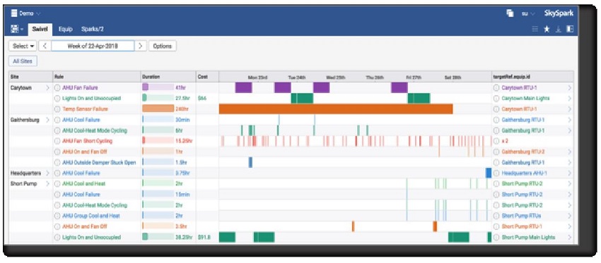
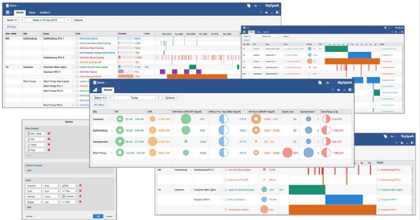
Here’s a quick example. The App that presents “Sparks” –
analytic results – is considered the focal point of SkySpark for most
users. That App has always provided users with clear, intuitive views
of analytic findings. The default view shows the key attributes of
Sparks the Site, the Rule, the Duration, the Cost and our “sparklines”
which show the exact pattern identified in the data.
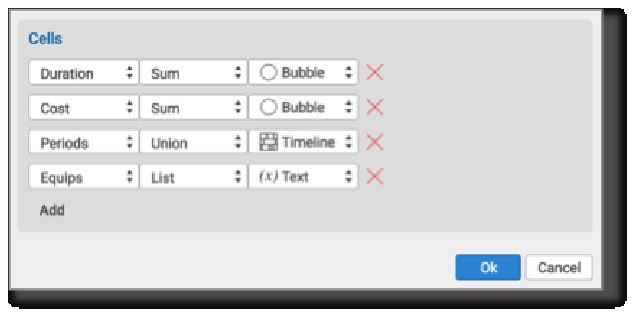
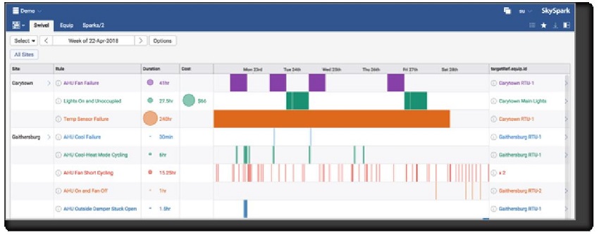
But
let’s say I want to show duration and other attributes in a
different graphical format. With a simple click on “Options,” I can
choose different display options. In this case, I will show Duration
and Cost as “bubbles.” (Options include bubble,
bar timelines, and text)
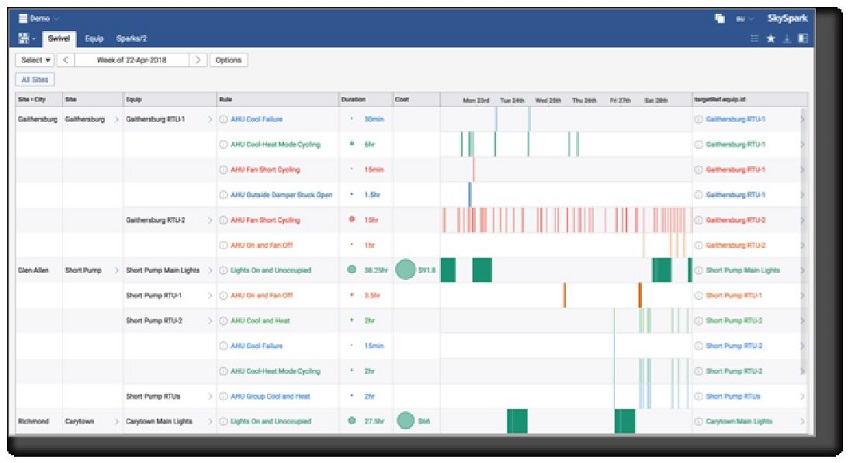
Now
let’s say I want to organize the Sparks-based on different
attributes. In this case, I will group my Sparks first by City, then
Site, then Equip and finally by Rule:
We
are really just scratching the surface of what you can do with
Swivel, and it’s hard to convey software interaction in a static
document. In order to grasp its full potential, you really need to see
it in action. You can contact us at info@skyfoundry.com to learn
more.
[an error occurred while processing this directive]
[Click Banner To Learn More]
[Home Page] [The Automator] [About] [Subscribe ] [Contact Us]