We know for a fact that good images that are properly labeled win more clicks in searches.
 Manny
Mandrusiak CD.
Vocational Rehabilitation Consultant
Vancouver
Island Works Project
SISIP Rehab Services
Lifeworks! Consulting
|
August 2018 |
[an error occurred while processing this directive] |
|
Study Part 3- Why Good Images
Matter
We know for a fact that good images that are properly labeled win more clicks in searches. |
|
| Articles |
| Interviews |
| Releases |
| New Products |
| Reviews |
| [an error occurred while processing this directive] |
| Editorial |
| Events |
| Sponsors |
| Site Search |
| Newsletters |
| [an error occurred while processing this directive] |
| Archives |
| Past Issues |
| Home |
| Editors |
| eDucation |
| [an error occurred while processing this directive] |
| Training |
| Links |
| Software |
| Subscribe |
| [an error occurred while processing this directive] |
We have all heard the line “A picture is worth 1000 words”, and I would absolutely agree with that statement. In today’s age of “information overload,” the images that you have on your website may mean the difference between someone staying or leaving.
Do your images tell viewers what you do?
In the case of our electrical
contractor, he hired someone to develop his website and gave them the
autonomy to create the website however they wanted. He did this
because he knew that he needed to have an online presence, but he was
not aware how a poorly designed website could hurt his business.
Our contractor was used to sourcing jobs the old-fashioned way; using networking and word of mouth. In his mind, his website was to stay competitive with the cool kids. He did not realize how important the website was until his incoming calls slowed down.
The first thing that we noticed about
his website was that the main image on the homepage was of tall glass
skyscrapers. It looked like downtown Vancouver, or Calgary, and
not Victoria where his client base is. Secondly, nowhere on the
homepage were any images of anything related to electrical
contracting. To someone visiting the website for the first time,
this can be extremely confusing. It makes the viewer have to stop
and think about what kind of business this is and are they in the right
place. When this happens, people move on to the next website on their
Google search, and our electrical contractor has lost a potential
client without even having the opportunity to speak with them.

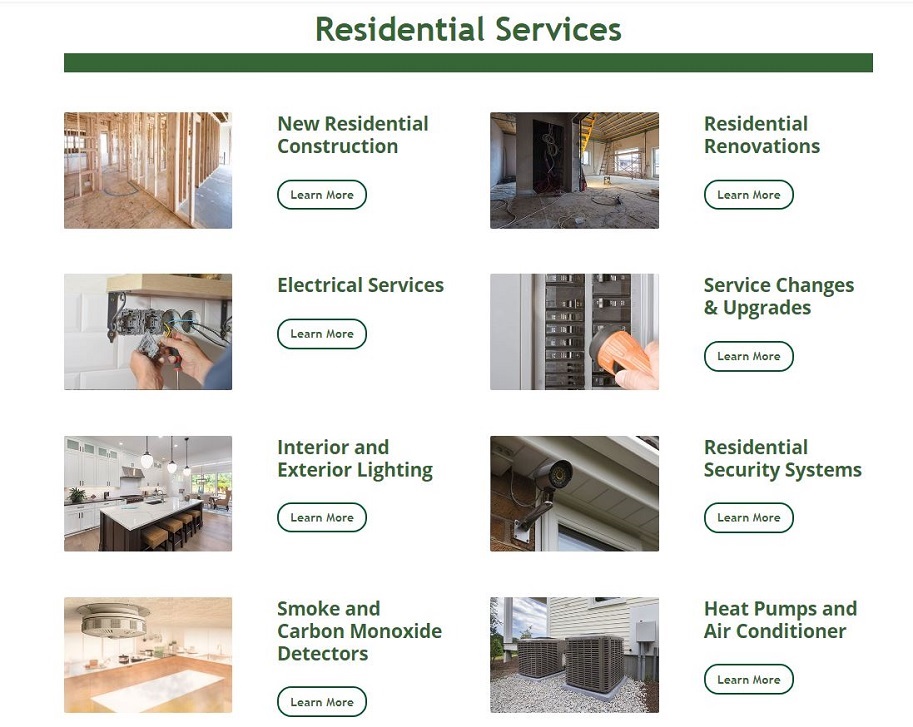
Figure One- We
reworked the contractor’s
Residential services page to that it was extremely visually easy to
take in. People viewing his new site on a mobile device will quickly
identify with the service that they are looking for with the image
before they read what the services are.

Figure Two- We did a very similar thing on the contractor’s Commercial
Service page. We don’t want viewers to pause and think. The viewer will
know if they want Commercial Services or Residential Services. That is
click one. Click number two will be finding the service that they want
and click number three will be to either get more info or request a
quote.
I had a similar issue with a client in
Calgary who is running for the
nomination with the Conservative Party in Calgary Centre. He used
a website builder to create a one-page website for himself and then
realized that he needed my help to build out the rest of the
website. The first thing that I noticed was that he used a
picture of the parliament buildings in Ottawa for his main image.
While the image makes one think of
politics, it does not represent
Calgary or the riding that he is seeking the nomination in.
Again, a new viewer of the website has to pause and wonder if they are
in the right place. This is a huge mistake on the web. We get hit with
so many messages a day that when we design a website for a company, we
do not want the viewer of the website to pause and think. We want them
to do one of three things:
We know for a fact that good images that are properly labeled win more clicks in searches. Why? As a species, we are responsive to images. It is hardwired into our DNA from prehistoric times when we were hunters and gatherers. Attractive objects attract attention. It’s that simple. In this case what we are trying to do is get the brain of the viewer of the site to make a mental check mark in the box that they are in the right place to find what they want.
[an error occurred while processing this directive]Example- If I want to order a pizza and I type “Pizza Delivery in Victoria, BC I am going to get a list of returns for websites that sell pizzas. When I start clicking on the links my mind is already thinking about the pizza that I want to order. When I see the image of a pizza that is attractive to me, my mind knows that I am in the right place and will push me to see more images of awesome pizzas from the company that I selected.
Humanizing a Business
The other thing that we try to do with
images on a website is to
humanize a business. People want to deal with people. If you have
a website that looks very sterile and not friendly you will lose
business; however, if you have a website that shows people doing
electrical work then in my mind I have humanized the company because I
can relate to the people in the picture.
If I look at an electrical contractor’s
website, I am expecting to see
people installing or fixing something. I am expecting to see images of
service vans, and all things electrical. I know that I am in the right
place, and I am not wasting my time. It also helps if I can see a
map, or that the business is locally owned.
These are just a few of the tips that we
use when designing websites
for clients. The biggest thing to remember is that thanks to the
internet, people want instant gratification. If they come to a
website
that makes them question if they are in the right place- they are gone,
and so is your opportunity to earn their business.
[an error occurred while processing this directive]
[Click Banner To Learn More]
[Home Page] [The Automator] [About] [Subscribe ] [Contact Us]